Chris Bikes
On the path to become a Figma expert and improve UX/UI skills : Figma UI UX Design Essentials Course
October 2023 → December 2023 (2 months)
UX Designer - Online learning (Udemy)
Context : summary
I recently completed a course to fully solidify my transition from XD towards Figma. In this course, a random project generator was used to obtain a base and a common thread throughout. I decided to push the project further to obtain a high fidelity and comprehensive retail mobile website. I wanted to have this work done and integrated here quickly. In order to simplify things I also decided that :
The brand would sell only one product
I will not try to rework the name of the company nor the logo made in the course
If you wish to have more information about context please refer to the appropriate section below.
Methodology


Mock-ups
Product page - social media posts
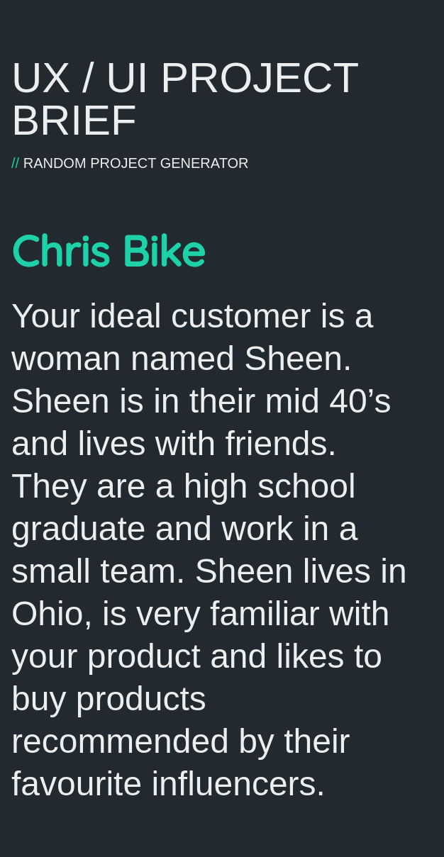
Illustration : output of the random project generator.
The design of the product page was a great opportunity to try to use the information given in the project brief about the target user of the brand (see illustration).
The purchase decisions of this user seems to be influenced by social media content therefore including a space that includes this type of content should be beneficial to the brand.
Product page - reviews
Good reviews are key in e-commerce. This is supported by evidence from the business world and from academic research in Psychology (see Chen et al., 2022 for example). Consequently, proposing a good user experience on this page is fundamental. Here, it comes down to the readability of the review cards and on how the options to handle the content are presented.
Thankfully, reviews typically don’t contain too much parameters on which to filter and sort so making them readily available to the user is possible without taking too much space. More importantly, the selection and the feedback on this selection can be done and shown on this single screen without having to leave it which is the best solution when feasible.
To foolproof my work I used this great ressource on designing filters.
Product configuration - cart - checkout
It was important for me to have a product configuration page as it was a feature that was quite common in the bike market. The main visual challenge of this page was to be able to have a color picker that doesn’t disrupt the visual identity of the page while still being usable. Each color is a line which takes up a lot of space however, that allows :
a color preview of a significant size to be shown and easily perceivable
a generous touch target
a unified appearance with the rest of the parameters
For the checkout page it is important to provide a quick summary of what was selected in the previous step so the user doesn’t have to come back if one element is forgotten (even if it seems that the number of parameters seem manageable. Reminder : the 7+/-2 rule is a myth).
Account page : order tracking
Order tracking variation : order delay example


Order informations and tracking is an area where the user experience isn’t always great. It was particularly important for me to design a flow that gives the right information at the right times and at the right places.
I took a lot of inspiration from this case study especially for the tracking part where I showcased how the user is informed about any problem about their order which has great impact on user satisfaction and therefore on key KPIs for business.
Account page : addresses management
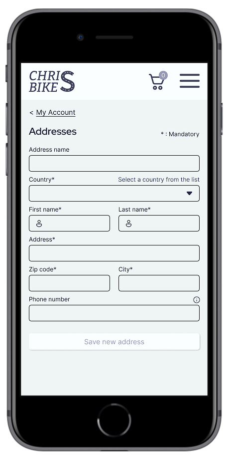

For the design of the text fields I decided to follow the recommendation of the Nielsen Norman group on the matter which is to leave out any placeholder text as they aren’t accessibility compatible. Instead, the only field that needed instructions (the country drop down field) had them placed outside of it.
Another interesting aspect of this page is that users with no address saved are directly shown the form to create a new one without having to manifest their desire to do so, saving an input.
Account page : personal information

Signing up

Another aspect that could be tailored to the persona specifics given in the project brief were the choices of social media for the direct sign up / log in. Here the choices are consistent with the demographic informations provided : facebook for the age group and pinterest for the gender.
Signing up variations : errors and password strength


Account creation has a couple important milestones as far as user experience is concerned.
For the email field clear feedback, both visual and textual, has to be provided for the user to be able to effectively correct any mistake that can occur.
For the password, clear guidelines exists (see here or here). For example, the app cannot let the user use trial and error to figure out what are the website’s rules to validate it. Therefore as soon as the user edits the password field clear those rules should be provided. A password strength is also efficient at encouraging the user to create a stronger password. Finally showing the password by default is a solution that promotes usability as a net gain for the user as the sacrifice of security is superficial :
[…] there’s a visible touch keyboard directly below the input field that highlights each key as you press it. These bits of feedback show the characters in a password at a larger size than most input fields. So in reality, the •••• characters aren’t really hiding a password from prying eyes anyway.
Luke Wroblewski, Google
Context : details
Until recently, I always worked with Adobe XD to fulfill any design need but Figma now has completely taken over. As an improvement from how I learnt XD, which was from heterogenous tutorial sources, I decided to take a well rated course from a reputable online learning platform : Udemy.
The course objective was to learn all of the essential tools that Figma proposes to the user to be able to work on UX/UI professional projects.
Once the course done and the certificate well-earned, it was recommended to take the project to a professional and realistic standard. The result of that initiative is what I’m going to present here.
Brief
As with many courses a project idea generator is used to base the whole course on. After a couple of informations were provided a brief was generated (see illustration).
It contained the brand name made up of two variables : a name and the type of product we were designing a website for. It also contained a short description of a basic persona for the brand.
Course content
The point of the course was to cover a maximum of ground about what Figma is like to use in a professional setting. A lot of what was covered I already learnt and practiced on Adobe XD. However, I also learned a good deal about new functionalities, best practices and workflow optimization.
Without going too much in details, the course covered the following areas in Figma :
Wireframes (both low and high fidelity)
Frames and their specificity (vs groups)
Autolayout and constraints
Styles (color, text, effects)
Columns and grid
Components and variants (including multi-dimentional variants)
Prototyping (animations, micro-interactions)
Plug-ins and the Figma Community
Figma interface specificities and best practices :
Pages
Team libraries
Commenting and sharing
Clear and reasonable requirements
As the course objective was to learn about Figma and not really to produce a realistic website, its structure was kept extremely simple, as illustrated by the taskflow below.
I knew that if I wanted to take this opportunity to add a realistic looking website to my portfolio I had to deepen the structure so I transformed this task flow into a user flow to help identify the missing parts.


Moreover, I also knew that if I wanted to design this mobile website in a reasonable amount of time I had to simplify the requirements.
I therefore decided that :
I was going to produce a mobile website only
For a brand that sells only one product
I will not try to rework the name of the company nor the logo made in the course